,In 2010, I was invited into a moment of artistic rebirth - one that required more than design skill, it demanded discernment. The artist the world knew previously was stepping into a new era, shedding an old brand and preparing to emerge as B.Slade, a name charged with electricity, intention, and creative possibility. My assignment was simple on the surface: create a logo. But underneath, it was intentional identity work.
The first step was understanding the man behind the moniker. This wasn’t a pivot for shock value; it was a declaration of independence from the narratives that tried to confine him. So the logo needed to move like he moved - fluid, forward-leaning, and fearless in the face of the unknown.
I started brainstorming concepts with one symbol in mind: lightning. I didn’t want to be literal or cartoonish, but I wanted the branding to align with the journey. I embedded the essence of that symbol, an emoji, into the typography itself.
We explored dozens of typefaces, but the winner was a sans serif that hit the sweet spot between retro and futuristic, clean enough for modern minimalism, but bold enough to echo vinyl-era confidence. It felt like a bridge, past mastery meeting future innovation.
Once the parts of the logo locked into place, the symbol became more than branding. It felt more like a digital talisman. A signal flare for the cool kids in the know. A timestamp on the moment an artist reclaimed his narrative and invited the world to meet him on his own terms. Today, B.Slade can be seen wearing a lightning-shaped ring during special performances, a subtle clue about the kind of energy he brings to the stage.
Designing that logo wasn’t just an extention of my years of creative direction, it was helping introduce the new chapter of a legacy still unfolding, one creative spark at a time.
2.0
#BSlade #Slayerz

By the time most people heard “Make Me Over” on Out The Box, its chorus was already ghosting through Oak Park 92105's background vocals. The project was already in the ears of Nureau's dedicated fanbase. In 2003, burned CD-Rs and whispered links carried this double album through the Nureau Underground, leading up to its eventual 2005 and early 2006 iTunes drops.
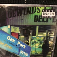
Oak Park was the unofficial sequel to the original 1997 version of PTN, much in the same way Dr. Dre’s 2001 was an extension of The Chronic. Same protagonist, same city, but older eyes and heavier truth. Our job was to give that evolution a face and more centralized neighborhood to live in.
At it's core, the process wasn’t a glossy label rollout; it was guerilla filmmaking with key stills. I handled the photography and booklet design, building layouts in an early-2000's Adobe Creative Suite while the artist unpacked stories track by track. The booklet became a map of memories: fresh shots layered with childhood photos, present-tense struggle collaged with family history.
We would literally cruise through the Oak Park community with no shot list, just intuition. If a corner, field, or storefront hit a nerve, we pulled over. Santa Margarita. Chollas Parkway. The field. The childhood home. The Tradewinds liquor store. Each stop was less about scenery and more about life's revelations - visual footnotes to lyrics that were already pushing Christian music into uncomfortable honesty. Due to some of the more mature themes at the time, it became the first Gospel album to carry the "Parental Advisory" sticker.
Those 2005–2006 covers and inserts weren’t just packaging. They were proof that a PK from Southeast San Diego could treat his own zip code like sacred text, using visual storytelling to turn an entire neighborhood into liner notes.
2.0
#Nureau #InksetForever

Contributing to Voices On the Inside never felt like a typical creative assignment. It was a chance to help restore dignity, amplify truth, and place the humanity of incarcerated women at the center - clear enough for people to really hear them.
My work began long before opening day. I partnered with the Poetic Justice California team to scout the site, study the flow of the room, and map how each piece would shape the visitor journey. We walked the floor, built the emotional arc, and made sure the space supported both reflection and revelation.
When it came time to hang the artists’ work, we treated it as sacred labor. Every poem, photograph, and handwritten story carried a life behind it. Our job was to honor that life through placement, spacing, and silence - creating an atmosphere where their voices could stand tall.
One of my key contributions was designing an interactive board that book-ended the exhibit. It acted as an anchor, inviting visitors to ground themselves, respond, and connect more deeply with the stories in the room.
I also pushed for a way for the women to be heard, not just seen. That led to integrating QR codes throughout the exhibit, now an essential element. Visitors could scan a code and hear the artist speak about her work, her journey, and what it means to create from the inside. It closed the distance incarceration tries to widen.
Beyond the installation, I collaborated with Lorenzo “Lxgend” Burroughs on a mini documentary that captured the heart of the exhibit - the atmosphere, the community, and the artists’ impact. It became a companion piece that allowed the experience to live beyond the gallery.
This project wasn’t just creative work; it was communal work. It reminded me that art can open doors, challenge assumptions, and return humanity to places where systems have tried to erase it.
Voices On the Inside reaffirmed why I create: to bring light to lived experience and help people be heard - especially those the world tries to overlook.
2.0
#PoeticJusice #VoicesOnTheInside

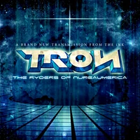
The Ryderz Of Nureaumerica wasn’t just another compilation. It was a transmission from the future back to the present. Released in 2008 as a collective Nureau project, it gathered a wide spectrum of artists into one futuristic soundscape. I contributed both visual and vocal assets, appearing on Tumblin’ Down and Sunrise Sunset.
The artistic direction pulled from early 2000's futurist aesthetics, especially the idea of the grid as visual metaphor - a nod to the 80's era’s digital landscapes: glowing lines, endless planes, and coded worlds. It mirrored the collective itself, each artist their own program running within a larger creative system. 2.0, T.Bizzy, Kimmé, AppleJaxx, Doña Vigor, Omega Mythologist, Korotha Kofé (then Mic Blu) and others all contributed their own sonic algorithms.
The cover art invited listeners into that world. The album title sat above a neon-lit digital horizon, introducing Inkset and the extended Nureaumerica as pioneers of a new musical frontier. This sense of worldbuilding had been seeded years earlier. Back in 2002 on Mockinbyrd Slang: The Voice of Nureaumerica, Piff Herrera dropped the prophetic line: “What’s TRON / Honda? / The Ryderz Of Nureau / Dig it in your medulla oblongata,” hinting at the movement.
While a grayscale image of the Azusa Street Mission appeared on the original back cover, few saw it. By 2008, digital distribution was transforming the industry, pushing listeners toward MP3s, downloads, and early streaming platforms. That shift made the front cover the primary visual portal, an entry point into a universe where faith and The Futureverse collided.
For us, this project marked a moment when art activists, singers, emcees, and producers from across the Nureau movement synced up like a network coming online. Every track carried its own signature. Every artist held their own space. And the grid became the perfect symbol for a creative community wired for something far ahead of its time.
2.0
#Nureau #InksetForever

When Futureverse Studios was asked to design the cover art for Tisha Campbell’s 2015 single Steel Here, we were given something often unheard of in the industry: full creative freedom. No brief. No storyboard. Just trust. And with a song rooted in healing and reclamation, the art had to reflect who Tisha is now, not the shadows she’s walked through.
Her gaze became the anchor. Clear, steady, unguarded. Two portals pulling you into the truth of her present self. Not a retelling of trauma, but a woman choosing her own narrative in real time.
Another intentional choice: the name “Tisha,” standing alone. No last name. No industry spin. Just a first name reclaiming its own authority.
In the music video, directed by Viktorija Pashuta, Tisha used excerpts from a real apology letter painted across her skin to confront the residue of early childhood wounds. I didn’t replicate the text for the cover, but I channeled its energy. That moment when someone looks in the mirror and sees not hurt, but the will to rise.
Everything unnecessary fell away. No body. No props. No noise. Just her face, carrying both the forgiveness she’s spoken of publicly and the steel beneath it.
When the single dropped, listeners called the visuals "powerful", "honest", and "brave". The imagery ran alongside features on BET, The Steve Harvey Show, VIBE, Billboard, and more as Tisha united with B.Slade, producer of both the single and the larger album project.
With no boundaries, I approached the art like a fusion of portraiture and confession - minimalist, intimate, emotionally weighted. The goal wasn’t nostalgia. It was revelation.
Steel Here wasn’t just a single. It was a statement. And I’m honored Futureverse Studios was trusted to frame that Moment.
2.0
#TishaCampbell #SteelHere

It started with a call.
Years ago, an artist from Sony’s newly formed Battery Records rang me up, voice sharp with urgency. Their last designer wasn’t catching the vision, and the deadline for the Unspoken cover art was approaching quickly. The opportunity was too big to hesitate. I cleared my schedule and locked in for a 36-hour sprint that pushed every creative muscle I had.
When the artwork finally landed, it said everything without uttering a word.
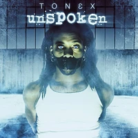
From an emergency afternoon photoshoot, I chose an image where the artist sat bound and silenced - hands tied, mouth taped, speaking only with his eyes. It wasn’t shock value; it was truth. Behind the scenes, there were things he couldn’t say aloud, but the imagery carried it all between the lines. The warehouse backdrop was freezing, breath hanging in the air, frost curling at the frame like he was suspended in emotional cryostasis.
The eyes were key. I pulled their electric blue from stock photos of an infant's gaze - truth, justice, clarity. It gave him an evolved, almost superhuman aura, a figure surviving a system determined to mute him. A subtle black eye hinted at the battles fought along the way, and the duct tape wasn’t just literal. It was the sentiments of being Unspoken.
When the album dropped on March 17, 2009, it hit the MySpace homepage and the internet erupted. Why was he frozen? Why the glow? Was it rebellion? Symbolism? Something deeper? Everyone had a theory, and that’s the power of art. It provokes, questions, and stirs.
This project marked the final chapter for the artist before the stagename’s retirement, and for me, it was a milestone: my first national end-cap placement, and my first high-profile cover. Credit was lowkey, so I literally hid my logo on the back as an easter egg.
Unspoken reminded me that pressure sharpens vision. At Futureverse Studios, that’s the work: crafting art that speaks long after the moment has passed. Unspoken’s single, “Blend”, would go on to earn a Grammy nomination.
2.0
#Nureau #Inkset

When I first sat down to help create The Scholarly Sewist, I knew we were doing more than a one-off. We were documenting the birth of a movement within academia. It all started with PhemmeD, a t-shirt series celebrating women of color earning or holding PhDs. We ordered custom fabric printed with a collage of scholarly articles, and Dr. Reka Barton cut and stitched that fabric into her first handmade shirt. That single piece sparked a wave. The PhemmeD line soon expanded into limited-edition totes, pillows, and small-batch accessories that blended academic identity with intentional fashion.
As the momentum grew, the brand needed a visual language that could evolve with it. During the later stretch of the PhemmeD campaign, I designed the now-signature “S” lettermark - a clean, diploma-inspired emblem threaded with a subtle needle motif. It was built to carry symbolic weight while expanding the brand beyond one product line. That mark became the anchor for a broader identity, merging scholarship and style into a unified aesthetic.
From that foundation, we developed a full visual ecosystem: bold yet disciplined typography, a warm neutral palette accented with golden yellow, and UGC-style photography centered on travel and Black Girlhood in scholarly spaces. The brand needed to feel academic without being rigid, fashion-forward without losing its soul.
Our work naturally expanded into Manuscript Mixtapes, a multimodal series exploring scholarship, identity, and creativity, and later came Craftivism for the Soul, a collaboration with Futureverse Studios that uses visual design to highlight sustainability and self-expression. My role has been to translate purpose into visuals, ensuring that every color, typeface, and graphic echoes the same heart as handmade and curated garments.
Watching The Scholarly Sewist grow from a pandemic moment into a recognized movement has been deeply rewarding. When design honors lived experience, it does more than look good. It speaks.
2.0
#TheScholarlySewist #CraftivismForTheSoul

In 2006, there was a small studio my father built inside the old conference room of the church. It wasn’t glamorous by any means - just carpet, cables, and basic gear. It became the birthplace of a new chapter in the Nureau timeline. A particular artist and I met there at least twice a week, chasing ideas, healing through sound, and shaping what would become the official launch of the movement's infamous producer.
Food was part of our ritual.
Before getting to designs, we would hit the local taco shop for rolled tacos. As natives, those late morning food runs felt like an extension of our art, taking in the neighborhood vibes before locking in at the studio. On those drives, hooks were formed, concepts sharpened, and the visual storytelling took shape.
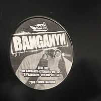
The first single, Banganyn, set the tone. We created a full kit featuring an SD snapback and custom graffiti stencil. That design became the foundation for the T.Bizzy brand, mysterious yet bold. It captured the transition from his earlier alias T.Boy into the fully realized producer-rapper artist identity. His evolution came after a heavy stretch as he'd already pushed boundaries on previous works like PTN, O2, and Out The Box, while navigating label conflicts and controversy around his self expression.
By 2008, the hiatus was real. The weight of Nureau's absence from the Gospel mainstream was real. Reinvention wasn’t a luxury at this point. It was necessary. T.Bizzy: The Album debuted on Apple's iTunes in February that year, with a vinyl release of Banganyn for the DJs. This was a space where the artist would reclaim himself as an indie powerhouse, with the second single, "Tortilla Chips Featuring Kimmé", starting a wave of viral dance videos on YouTube.
It was from that studio that we crafted the aesthetic for a persona that was sharp, clever, and unfiltered. Those late nights, cheap meals, and bold ideas still echo as one of the most honest, creative seasons in my journey within The Futureverse worldline.
Listen to T.Bizzy: The Album on Apple Music.
2.0
#Nureau #NureauInk #InksetForever

We had just wrapped choir rehearsal at the church, laughing with family, when my phone rang. Calls then weren’t unusual, but this one was urgent. The producer of "Out The Box" basically needed an overnight visual treatment for the song, “Games”.
It was one of those moments when time slowed just enough to signal I was stepping into something bigger than a routine rush job. I didn’t have a crazy setup though. Just CorelDRAW 11, Photoshop 8, and a stubborn confidence shaped by the Black church. But Nureau culture legit raised me to thrive under the pressure. It demanded innovation and turned raw talent into diamonds. So when the request came, instinct took over. The first asset I built was the stylized cross and tambourine that became the base for the virtual set.
I freehanded everything in Corel with the pen tool, shaped each curve, and added depth with extrudes and gradients, before exporting to Photoshop to composite. After finishing, I passed the files to the video editor, who blended them with concert footage to form the sequence that ended up on DVD. That same weekend I created other Nureau branding like “iNK TV”—small touches that extended the meta language of the Nureau movement that had been shaping for years.
When the DVD dropped, watching it felt surreal. Seeing the choir. My city. The massive live recording captured at full scale. It took me back to the studio sessions where my mother and brother tracked vocals as founding members of the choir. It took me back to the Four Corners after-party where the whole neighborhood felt like it was part of history. Seeing myself in crowd shots, and finally my name in "Special Thanks". It wasn’t just about credit, but having a full circle moment. I'd lived every layer of Out The Box—from pre to post-production.
Looking back, the designs feel simple compared to the new tech, but they were exactly what the moment needed. It was proof that preparation and opportunity can align you with a legacy that was already waiting on you.
2.0
#OutTheBox #Nureau #NureauInk


