-
 B.Slade: Rebranding An Icon
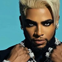
In 2010, I was invited into a moment of artistic rebirth - one that required more than design skill, it demanded discernment. The artist the world knew previously was stepping into a new era, shedding an old brand and preparing to emerge as B.Slade, a name charged with electricity, intention, and creative possibility. My assignment was simple on the surface: create a logo. But underneath, it was intentional identity work.
The first step was understanding the man behind the moniker. This wasn’t a pivot for shock value; it was a declaration of independence from the narratives that tried to confine him. So the logo needed to move like he moved - fluid, forward-leaning, and fearless in the face of the unknown.
I started brainstorming concepts with one symbol in mind: lightning. I didn’t want to be literal or cartoonish, but I wanted the branding to align with the journey. I embedded the essence of that symbol, an emoji, into the typography itself.
We explored dozens of typefaces, but the winner was a sans serif that hit the sweet spot between retro and futuristic, clean enough for modern minimalism, but bold enough to echo vinyl-era confidence. It felt like a bridge, past mastery meeting future innovation.
Once the parts of the logo locked into place, the symbol became more than branding. It felt more like a digital talisman. A signal flare for the cool kids in the know. A timestamp on the moment an artist reclaimed his narrative and invited the world to meet him on his own terms. Today, B.Slade can be seen wearing a lightning-shaped ring during special performances, a subtle clue about the kind of energy he brings to the stage.
Designing that logo wasn’t just an extention of my years of creative direction, it was helping introduce the new chapter of a legacy still unfolding, one creative spark at a time.
2.0
#BSlade #Slayerz